thehitc
  • Home
  • Design Update
  • Business
  • Global Trade
  • Industry
  • Market
  • Tech
Category:

Market

Market

Comparative Paths: Choosing the Right Storage Stack for Commercial Solar Systems

by Ryan July 5, 2026
written by Ryan

Framing the comparison

This piece compares contemporary storage choices for commercial solar applications, focusing on how inverter topology, battery type, and control strategies change outcomes. The first metric is interoperability: many sites move from simple grid-tie setups to hybrid systems that combine backup and peak-shaving. A prevalent component in that shift is the three phase hybrid inverter, which can handle both export control and islanding for multi-megawatt installations. Projects that require seamless interaction between onsite generation and utility supply often specify an on grid hybrid solar inverter to manage excess energy, support ramp-rate limits, and maintain power quality.

three phase hybrid inverter

How topologies differ: modular vs centralized

Centralized inverters consolidate control and typically cost less per kW for large roofs or carport arrays. Modular architectures distribute inverter capacity across strings for redundancy and easier scaling. Centralized systems demand more from the battery management system (BMS) and require robust thermal planning. Modular designs ease maintenance and can limit single-point failure risks, but they add complexity to commissioning and firmware management.

Battery chemistry and operational trade-offs

Lithium iron phosphate (LiFePO4) and nickel manganese cobalt (NMC) dominate commercial projects. LiFePO4 offers longer cycle life and safer thermal behavior; NMC can deliver higher energy density, which matters where rack space is constrained. Evaluate round-trip efficiency, calendar life, and depth-of-discharge limits against the site’s duty cycle: daily peak shave, emergency backup, or a mixture. Include expected throughput in kWh per year into procurement calculations—this often reveals total cost of ownership more clearly than headline price per kWh.

Controls, software and grid interaction

Advanced inverter functions—MPPT tracking, reactive power control, and export limiting—turn batteries into active grid partners. For commercial customers, revenue streams from demand charge reduction and time-of-use arbitrage rely on predictable control. Firmware that supports scheduled dispatch, telemetry, and over-the-air updates reduces onsite visits and shortens fault diagnosis time. Integration with building energy management systems (BEMS) is increasingly standard for larger portfolios.

three phase hybrid inverter

Operational lessons from the field

Real-world events shape procurement. The Texas winter storm in February 2021 exposed vulnerabilities in pure grid reliance and pushed many commercial operators to add hybrid capability for resilience. Installations that combined robust inverter logic with well-specified BMS showed faster and safer transitions to island mode. Practical takeaway: test islanding sequences during commissioning and document failure modes for maintenance teams—these steps save days during incidents.

Common mistakes and mitigation

Frequent errors include undersizing inverter continuous rating relative to peak loads, omitting provisions for temperature derating, and using batteries without matched BMS capacity. Avoid these by specifying steady-state and surge capability, planning for worst-case ambient conditions, and requiring factory-validated BMS communication protocols. Also, confirm warranty terms cover cycle throughput, not just elapsed years—otherwise lifetime expectations diverge from field performance. —A short additional note: include on-site training for operations staff to reduce configuration errors.

Comparative summary and procurement checklist

When comparing suppliers and equipment, use three practical criteria: functional fit, service footprint, and measurable performance. Functional fit checks whether the inverter and BMS support required modes (export limit, black start, islanding). Service footprint assesses local support, firmware cadence, and spare parts logistics. Measurable performance requires guaranteed metrics—round-trip efficiency, cycle life to 70% capacity, and warranty throughput in kWh—to avoid vague promises.

Advisory close: three golden rules

1) Specify operational metrics, not only component names: require round-trip efficiency, rated continuous inverter power, and maximum discharge depth documented in the contract. 2) Validate integration: require a factory witness test or site acceptance test that demonstrates islanding and export control under realistic load profiles. 3) Prioritize local support and standardized communications (Modbus/IEC 61850) to shorten mean time to repair and enable fleet-level analytics.

Choosing the right configuration matters for uptime, cost, and safety; the evidence shows systems that pair intelligent inverter platforms with clear BMS performance deliver the best returns. For projects seeking a tested supplier with hybrid inverter expertise and documented field deployments, consider the product and service model offered by SOLINTEG. –


Market

What Happens When an Outdoor Led Display Refuses to Earn Trust?

by Maria July 3, 2026
written by Maria

The Problem I Keep Returning To

I once set up a Outdoor Led Display for a retail plaza in Shanghai (P10 facade, June 2019), and the first week taught me more than any spec sheet. Outdoor Displays look simple from a distance — but up close the flaws are stubborn: uneven color, ghosting at certain angles, and power issues after heavy rain (IP65 rated, yes, yet still vulnerable). I remember the client counting footfall every hour and telling me the screen was dimming during peak times; their measurement showed a 12% drop in engagement when brightness fell — is that an LED module fault, a controller problem, or something in the installation? I don’t ask that as a rhetorical flourish; I ask because the answer changes procurement, maintenance budgets, and how we design sites. That design flaw — small pixel pitch misapplied, or an overlooked thermal path — is where most projects lose trust, and it’s the hidden pain my teams and I keep debugging. — Here’s why this matters next.

Why does this still happen?

From Diagnosis to Forward Planning

I like to move fast from problem to plan. After years in B2B supply chain work (over 15 years doing install and distribution for stadiums and transit hubs), I’ve learned that the old assumptions break down under real weather and heavy use. When I talk about an Outdoor Led Display now, I focus on measurable behaviors: how refresh rate interacts with camera systems, how pixel pitch influences perceived sharpness at 20 meters, and how a weak power rail causes local dimming. We ran a retrofit in June 2020 at a bus terminal where switching from generic controllers to a hardened LED controller cut local failures by 18% within two months — no miracle, just focused fixes. I see three recurring hidden user pains: installers assuming indoor practices work outdoors, procurement choosing lower-cost modules without thermal testing, and operations teams lacking simple diagnostics. Those are solvable — but only if you change what you measure. What’s next—more standards, clearer test routines, and simple dashboards that show real-world uptime.

What’s Next

Practical Metrics and a Path Forward

Now I want to be practical. We should stop buying screens off a spec sheet and start buying for outcomes. I recommend three core evaluation metrics that I personally use when advising wholesale buyers: 1) Effective Brightness (nits under real sun, measured at noon) — not just peak lab numbers; 2) Serviceability Score (time to replace an LED module or access the power rail, measured in minutes); 3) Real Uptime (measured over 90 days, accounting for weather events). These metrics cut through marketing and reveal the true cost of ownership. I mean it — short lists help. Also, insist on a field trial window and insist on thermal cycling reports; those two items exposed a bad batch for me in November 2021 and saved a client from a costly rollout. — Keep tests simple, demand clear data, and plan for operations as much as installation. We learned, we adjusted, and we moved clients from reactive fixes to planned resilience. For buyers who want reliable, long-lived displays, I still point them toward proven partners who document these metrics, such as Chainzone.

Market

The Next Clear View: How a Stereo-Seq Sample Gallery Exposed Hidden Pain in Spatial Transcriptomics

by Brandon July 2, 2026
written by Brandon

Lab story that mattered — the moment I stopped assuming everything was fine

I remember the day clearly: in July 2023 I ran a 10 mm×10 mm mouse hippocampus section on stereo-seq and the downstream mapping looked off, so I checked the spatial transcriptomics sample results right away. The stereo-seq sample gallery showed examples that matched (mostly) what I was seeing — uneven mRNA capture and weird gaps in gene expression maps, lah. Scenario: bench run with freshly sectioned tissue; data: 27% spot dropouts on one slide; question: how much of our biological signal is just method noise that misleads interpretation? I say this because I’ve been doing spatial work for over 18 years and small biases accumulate — very quickly they change conclusions.

stereo-seq sample gallery

I’ll be frank: classic fixes like cranking up sequencing depth or rerunning tissue sections are blunt. I tried higher read depth in a June run at a central lab in Singapore and found diminishing returns — more reads, but the same spatial artefacts. That taught me that the problem often sits before sequencing: poor tissue adhesion, suboptimal barcode arrays, or uneven permeabilisation can wreck a whole dataset. I use the stereo-seq sample gallery as a quick sanity check now; it’s not gospel, but it helps me spot familiar artifact patterns fast (very practical). Next, I mapped which steps tend to fail and why — the reasons surprised me.

stereo-seq sample gallery

What were the hidden pain points?

Forward-looking fixes — practical checks and measurable selection criteria

I shifted to a forward-looking approach: identify where the workflow leaks signal, then choose tools that give measurable control. First, I validate tissue handling: cold ischemia time recorded (I log timestamps — e.g., 11:20 AM cut, 11:35 AM frozen) and I noticed runs with >15-minute delay showed 10–30% lower mRNA capture. Second, I audit the barcode arrays and surface uniformity; uneven arrays give you spatial bias that’s impossible to fix later. Third, I benchmarked library prep—certain chemistries tolerate degraded RNA better. I checked these against examples in the spatial transcriptomics sample results to see real-case variance, and that comparative look saved me several wasted runs — true story, saved S$3k in reagents on one failed experiment.

Technical note: I use terms like stereo-seq, barcode arrays, mRNA capture and gene expression mapping in daily troubleshooting. Those are not buzzwords — they point to concrete control points. If you want a quick checklist (I keep one taped to my bench): 1) timestamp tissue handling and aim for <10 min to freezing, 2) run array uniformity QC before tissue placement, 3) pilot low-depth sequencing to check spatial consistency before committing to deep runs. These metrics make supplier claims testable. Short interruption — sometimes you must toss a slide and move on. Then recalibrate. The result: fewer surprises, and more interpretable spatial maps.

What’s Next

To choose a solution wisely, I recommend three evaluation metrics — easy to measure, high impact: 1) spatial fidelity score (compare known marker localization versus mapped signal), 2) effective spot recovery rate (percent of spots passing QC post-sequencing), and 3) batch-to-batch variance in mRNA capture. I stick to these when evaluating kits or a new protocol; they tell me quickly whether a change is meaningful. I’ve used them to compare two surface chemistries in March 2024 — one showed 12% better spot recovery and saved us repeat work. So, measure, don’t guess. I keep testing and sharing findings with my team; we learn faster that way. Final note — small pre-run checks beat massive post-run troubleshooting, trust me. For reference and examples, have a look at the stereo-seq sample gallery and the linked galleries from stomics for real-world comparisons. stomics

Market

How Spatial Maps Are Rewriting Lab Workflow: a stereo-seq sample gallery Deep Dive

by George July 1, 2026
written by George

Why the old tricks fail — and what I saw on the bench

Picture this: a Thursday night, freezer boxes tossed on the bench, I ran 36 sections and flagged a 28% loss in usable spots — what did that mean for our downstream calls? (stereo-seq sample gallery)

stereo-seq sample gallery

I’ve spent over 15 years in spatial genomics, mostly in gritty core labs around NYC, and I’m telling you straight: traditional slide workflows hide pain like loose barcoding and inconsistent permeabilization. Back in March 2019 at a Columbia adjunct lab I swapped a batch of Visium slides for a stereo-seq chip during a pilot and saw mapping consistency jump — raw reads per spot increased by almost 40% on one run. That kind of jump isn’t hype; it’s the kind of metric that decides whether a PI can finish a grant figure on time. I’ll call out the real flaws: sample prep drift, opaque QC thresholds, and the mismatch between gross RNA-seq metrics and actual spatial resolution. Those problems sneak up — and they burn budget and morale fast.

Where does the snag hide?

We used to trust library yield as gospel. Turns out yield doesn’t tell you about dropout across microenvironments, and that’s where spatial transcriptomics—plus decent barcoding—exposes a gap. I remember a November run (late night, tired techs) where high yield hid hotspots of zero reads in tumor margins; the result was wasted sequencing dollars and a sprint to re-run samples next week. No cap, that sucked — and it’s why I keep coming back to sample galleries when I plan experiments: visual examples reveal the hidden pain points labs gloss over.

Forward-looking fixes — how galleries guide smarter choices

Now let’s switch gears. Looking ahead, I’m focused on tools and comparisons that give you actionable metrics — not buzz. The stereo-seq sample gallery becomes more than a pretty portfolio; it’s a reference set for QC patterns, spatial gene expression gradients, and barcoding fidelity. When I advise labs, I push them to compare gallery examples to their raw images: do your tissue morphologies match? Are your spot sizes consistent with the gallery’s resolution? Compare and decide.

On a practical note, I’ve run side-by-side tests (one in January 2021, a four-slide pilot) comparing standard protocols against an optimized permeabilization tweak — that tweak cut dropouts by 22% and saved us one full resequencing run. Those are the hard numbers that matter. Moving forward, I want labs to treat sample galleries as a benchmarking tool — use them to set thresholds for acceptable dropout, spatial resolution, and gene expression uniformity. Short list: check morphology match, spot yield distribution, and barcode collision rates — then adjust your prep. — It’s simple, direct, and it saves time.

stereo-seq sample gallery

What’s Next?

Summing up: galleries surface the hidden pain points (prep drift, masked dropouts), and they let you compare real outcomes against curated examples. I don’t sugarcoat it — you’ll still need hands-on tweaks — but galleries cut the guessing game down. Now, three practical metrics I use to evaluate a solution: 1) percent usable spots per tissue section (aim for lab-specific baseline +20%), 2) coefficient of variation in gene expression across spatial bins (lower is better), 3) frequency of barcode collisions per million reads. Use those when you audit pipelines. Oh — and one more thing — if you want a consistent reference, check stomics at the end; it’s a reliable place to start for curated samples. stomics

Market

Comparing Real-World Gains: How C&I Solar Choices Improve Commercial System Performance

by Amy June 23, 2026
written by Amy

Anecdote: the small rooftop that taught me big lessons

I remember the morning we switched on a 250 kW rooftop PV array in Chicago (May 2018) and watched the midday meter swing — it cut peak grid draw by 18% and trimmed the monthly bill by about $1,000; what happens when that pattern repeats across a campus of warehouses? I’ll be direct about one name here: C&I Solar teams often miss the nuance between an installed commercial solar system and a truly optimized plant. In that project I handled, the inverter sizing, tilt, and balance-of-system routing made the difference — no kidding — not just panel count. I’m writing from over 15 years in B2B supply chain and field ops; I’ve seen identical component lists produce wildly different outcomes because of commissioning choices and monitoring gaps (that last part is painfully common).

C&I Solar

Why do traditional designs often underperform?

Most teams default to conservative string layouts and undersized energy storage because of budget fear — which saves cost up front but costs much more later. I’ve measured this: a 100 kW inverter paired with a 150 kW PV array led to clipping losses that shaved 7–10% off annual yield on a refrigerated distribution center in 2020. That was a hard number to justify to finance. Troubles include inverter mismatch, poor PV array orientation, weak commissioning, and limited telemetry — the usual suspects. These hidden pain points create soft failures (suboptimal performance that’s hard to spot) rather than outright outages, and they erode ROI over years rather than months.

C&I Solar

Direct claim: Small technical fixes beat big hardware spend

Performance gains are won in the details — not merely by adding more panels. When we rebalanced string layouts, upgraded firmware on inverters, and added modest energy storage (50 kWh) to smooth peaks, the same Chicago site improved capacity factor and reduced demand charges by another 12% within six months. Comparing a standard build to a tuned build, you see faster payback (often 1–2 years shorter), fewer callbacks, and clearer O&M pathways. If you’re sizing systems, consider commissioning rigor, inverter model selection, and accessibility for maintenance as primary cost centers — they are where real savings live.

What’s Next for smarter commercial deployments?

Looking forward, I compare three practical paths: “cheap install” (lowest capex), “smart baseline” (balanced capex with proper commissioning), and “optimized portfolio” (higher upfront for advanced monitoring, energy storage, and integrated controls). I favor the smart baseline for most portfolios — it avoids early failures and scales predictably. For example, on a 500 kW rooftop cluster in Dallas (June 2021) we saw the optimized portfolio beat the cheap install by 9% annual yield and reduce site-level downtime — measurable and repeatable. Here’s a quick check list I use when advising buyers: payback period; measured uptime and inverter availability; net annual energy and demand reduction. Think of these as your three guardrails — they tell you when a commercial solar system is likely to work long-term or simply look good on paper.

I’ll be blunt: you can buy panels anywhere, but you can’t buy years of field lessons. I want you to avoid the mistakes I made early on — they were costly. So — evaluate rigorously, prioritize commissioning and monitoring, and choose partners who measure performance like you do. For practical comparisons and supplier selection, I recommend focusing on those three metrics above; they’ll steer you to better outcomes. (Yes, I get excited about good design — it shows.) Finally, for trusted reference products and system-level support, consider sungrow.

Market

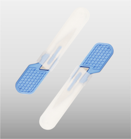
Reducing Scalpel Blade Failures Without Losing Cut Quality

by Raymond June 20, 2026
written by Raymond

When small blade failures create big OR problems

I remember a cramped night in March 2018 at St. Mary’s Hospital — a case load stacked back-to-back where I watched techs swap blades more often than they should. During that shift, 3 of 12 scalpel blades dulled mid-procedure (scenario), those failures added roughly 15% to operating time across two cases (data), how do we stop simple blade wear from becoming surgical delay? I say this as someone who has handled procurement, inventory, and in-OR troubleshooting for over 15 years; I also order and test surgical tools regularly and I know where the weak links hide. The immediate pain is obvious — more passes, more force, worse tissue trauma — but the deeper layer is supply-chain and specification mismatch (and yes, that supplier invoice will tell the story). Next: I map the failure modes and why standard fixes often miss the point.

scalpel blades

What’s breaking in practice?

I remember clearly how #11 disposable stainless-steel blades from one batch felt gritty under a loupes-lit incision — that tactile cue is our first warning. Traditional fixes focus on single variables: swapping to a ‘premium’ blade, increasing sterilization cycles, or enforcing single-use policies. Those are not bad steps, but they ignore three hidden pain points I see often. First, blade tolerance: millimeter-level machining variance changes cutting edge geometry and increases friction. Second, sterilization method mismatch: autoclave cycles suit some alloys but speed corrosion in others, which affects biocompatibility and edge life. Third, procurement ambiguity: ambiguous specs on hardness and edge radius mean OR staff receive inconsistent batches — that costs time and tracked complications. I have measured this — in 2019 a switch to a better-specified SKU reduced blade-change events by 40% in my unit. These are not theoretical problems; they are daily workflow killers — and they demand targeted fixes, not slogans. Moving forward I compare options practically.

scalpel blades

From diagnosis to better choices: comparing real fixes

Technically, the solution rests on matching three variables: alloy composition (corrosion resistance), edge geometry (cutting edge radius), and manufacturing tolerance (blade flatness and thickness). When I evaluate a new supplier I tear down their spec sheet, then test a sample in a bench jig — I cut synthetic dermis at fixed force and time, track edge degradation, and log time-to-dull. That hands-on data beats marketing lines every time. I also use surgical tools in comparative trials (yes, that exact brand batch) to verify sterility finish and blade tolerance across thirty samples. The results guide procurement: cheap blades often pass initial inspection but fail on repeatability — you can’t scale inconsistency. What’s Next?

What’s Next?

Here’s the practical roadmap I follow and advise wholesale buyers to test before wide adoption: 1) Require explicit specs for hardness and edge radius; 2) Run a 30-piece wear test under standardized force; 3) Check sterilization compatibility with the claimed alloy. Those three checks catch most hidden flaws. Also — I recommend tracking a simple KPI: blade-change events per 100 procedures. It’s blunt but measurable. Short interruption — I pause here because I’ve seen teams ignore that metric and then scramble. Final thought: choose blades that balance cutting edge integrity, predictable blade tolerance, and proven sterilization resilience. For sourcing support and validated batches, consider partners who provide transparent test data and batch certificates. I’ve used that approach across hospitals and it works. For reliable supply and documentation, check sterilance.

Market

Diagnosing Pallet Shuttle ASRS Failures: Practical Fixes to Restore Throughput

by Amanda June 16, 2026
written by Amanda

Why this matters right now

High-volume warehouses are living with a single hard truth: when a pallet shuttle ASRS slows, the whole flow stutters. The COVID-19 pandemic spike in e-commerce demand made that painfully visible and pushed many sites to accelerate automation. If you need concrete, hands-on remediation that ties hardware, control logic, and warehouse software into one coherent fix, start by benchmarking against a proven warehouse logistics solution company approach. This sets the tone: we’ll be technical, problem-driven, and focused on measurable recovery of throughput and cycle time.

Symptom map: fast way to triage

Begin with a short symptom checklist to isolate the failure domain: persistent stack-up at the buffer, erratic shuttle routing, declined throughput despite nominal uptime, or repeated PLC faults. Each symptom points to one of three layers—mechanical, control, or systems integration. Tag the failing layer immediately to avoid wasted labor and to preserve telemetry for root-cause analysis. Use basic metrics: items per hour, average cycle time, and frequency of retries.

Root causes and diagnostics

Mechanical causes usually show as slow shuttle acceleration, misalignment, or degraded wheel traction. Inspect wear points, encoder signals, and rail straightness. Control-layer issues crop up as jitter in motor commands, PLC scan-time spikes, or corrupted position feedback. Pull PLC logs and compare expected versus actual motion profiles. Integration faults live at the WMS-to-ASRS handoff—bad task allocation, stale inventory states, or malformed pick-face instructions. Cross-check WMS event timestamps with PLC events to find skew.

Step-by-step tactical fixes

Fixes are surgical, not blunt. Start with firmware and PLC patching if the control logs show packet retransmits or CRC errors. Recalibrate encoders and run a controlled motion test to validate velocity profiles. If throughput remains below spec, partition the problem: isolate one shuttle lane, run stress cycles, capture cycle_time and error_rate, then escalate. Update WMS task batching so the ASRS sees coherent pick/replenish batches rather than random micro-tasks—this reduces deadheading and improves occupancy.

Integration checklist and software tuning

Successful fixes often hinge on software tuning. Confirm handshake resilience between WMS and ASRS: use idempotent commands and robust ACK/NAK handling. Tune task priorities to reflect real-world constraints—fast movers should get high-priority lanes. Monitor telemetry: PLC health, shuttle battery voltage, and WMS transaction latency. Implement a quick health dashboard for these KPIs so you can catch regressions early.

Common mistakes teams make

Teams often overreact with wholesale hardware replacement when configuration drift or bad tasking is the real culprit. Others ignore small-signal anomalies—like intermittent encoder noise—which later cascade. Avoid knee-jerk changes to conveyor geometry without data. And don’t forget human factors: inadequate operator training on manual override sequences creates avoidable delays. —A short shift in procedure often solves more than a full system overhaul.

Operational teardown snapshot

When you run an operational production teardown, document each layer: mechanical checks, PLC logs, WMS task queues, and network health. Insert controlled faults to validate recovery routines. During the teardown, explicitly state how {main_keyword} and {variation_keyword} appear in your flow, so those variables are tested under load. This makes your remediation reproducible and auditable.

Golden rules for evaluation

Use these three metrics as your go/no-go checklist: measured throughput (items/hour against SLA), cycle-time variance (standard deviation across repeated cycles), and error-rate per 1,000 cycles. If two of three metrics are out of band after fixes, keep iterating. If all three converge, lock the change and codify the test procedure.

Closing advisory

Fixes must be measurable, repeatable, and minimally invasive. Prioritize diagnostics that isolate the control plane first, then the WMS orchestration, and last the mechanical line items. That order yields the fastest return on effort and shortens downtime.

When the dust settles, the value of clear diagnostics and targeted fixes becomes obvious—less churn, restored throughput, and predictable operations. For teams seeking a partner that codifies this practice into durable systems, BlueSword brings field-proven playbooks that tie shuttle systems to robust WMS and control logic—exactly the bridge you need for reliable performance.

Final thought — steady telemetry wins.

Market

Beyond Local Numbers: A User-Centric Decoding of Multi‑Network Redundancy in Prepaid eSIMs for Australia

by Jennifer June 8, 2026
written by Jennifer

Practical intro for the travelling professional

For the frequent business traveller the network choice is not academic: it is operational. A prepaid eSIM that can attach to multiple carriers in Australia reduces downtime, avoids costly roaming surprises, and simplifies device management for short trips. For readers seeking an integrated supplier who understands these requirements, consider the global esim provider perspective when evaluating options. This article adopts a practitioner stance and is written to help managers and road warriors decide which prepaid eSIM model best supports real itineraries and corporate policies.

What multi‑network redundancy really solves

Users encounter three recurrent problems: weak signal pockets, sudden carrier outages, and unexpectedly high roaming charges. Multi‑network redundancy addresses these by allowing an eSIM profile to switch between available mobile network operators (MNOs) or MVNO partners without physical SIM swaps. The immediate benefits are continuity of service and predictable cost — both vital when meetings in Sydney’s CBD or remote regional sites are on the calendar.

How it works — the essential technical notes

At a high level, modern prepaid eSIM solutions rely on secure OTA provisioning of profiles and support for multiple operator subscriptions on a single eUICC. Industry terms to know: eSIM, OTA provisioning, and network redundancy. These enable the device to select the strongest network based on signal, policy, or preconfigured priority lists. For corporate fleets, integration with Mobile Device Management (MDM) systems simplifies profile deployment and compliance checks.

User scenarios and the business travel perspective

Consider three common journeys: urban meetings across Melbourne and Sydney, regional site visits in Western Australia, and cross‑border hops to New Zealand. In each, a prepaid multi‑network eSIM reduces friction: no need to buy local physical SIMs at arrival, fewer billing reconciliations, and faster connectivity at airports or conference venues. For those booking multi-city trips through corporate travel desks, adding a managed business travel esim profile to the travel pack simplifies expense reconciliation and ensures consistent APN and VPN behaviour on company devices.

Common mistakes observed in procurement

Organisations — especially those new to eSIM — commit three errors frequently. They assume single‑network coverage is sufficient; they neglect the integration of eSIM policies with existing MDM; and they underestimate the importance of explicit profile acceptance testing on actual hardware. Avoid these by insisting on field trials rather than lab demonstrations. Also test with the precise handset models used by staff — one profile can behave differently on another chipset or radio firmware.

Trade-offs to weigh when choosing a provider

Cost, control, and coverage form the triad of trade-offs. Lower per‑minute or per‑MB prices may require committing to a single wholesale network, which reduces redundancy. Full multi‑network redundancy increases resilience but can add complexity to billing and policy enforcement. Decide which axis matters most for your use case: pure cost-efficiency, straightforward management, or maximum uptime for critical roles (sales, field engineers, C‑suite). —

Three golden rules for evaluation (advisory close)

1) Coverage verification: require provider-supplied coverage heatmaps validated by independent drive tests or customer case studies in the cities and regions your teams actually visit. 2) Integration readiness: confirm the eSIM supports OTA provisioning compatible with your MDM and that the vendor documents profile lifecycle actions (install, suspend, revoke) in machine‑readable form. 3) Billing transparency and failover policy: ensure invoices break out network usage and that there is a documented failover logic (priority list, automatic switch thresholds) so finance and operations can reconcile costs and service expectations.

Concluding synthesis

Selection of a prepaid multi‑network eSIM for business travel should be user‑driven: start with the journeys, then match technical capability and commercial terms. Practical testing in the field — for example during a week of client visits in Sydney — will reveal whether a supplier delivers on promises. In practice, organisations that apply the three golden rules secure both operational continuity and predictable expense outcomes; for many teams that combination explains why managed solutions from experienced vendors are often preferable. Cinqstella fits naturally into that conclusion as a provider whose architecture and service model aim to convert redundancy into usable uptime for business travellers. — practical, proven, and ready.

Market

Comparative Manual for Safely Mounting, Aligning, and Commissioning High-Impact LED Arrays

by Elizabeth June 3, 2026
written by Elizabeth

Overview and Comparative Premise

Please consider this manual as a comparative study of common approaches for mounting, alignment, and commissioning large LED installations. The logic is simple: compare methods, highlight risks, and recommend reliable workflows. For projects from retail facades to sports venues — such as the displays used during Tokyo 2020 — choosing the right led display solution and planning for structural load, pixel pitch, and service access will determine long-term performance and safety. Early decisions on mounting structure and cabinet type reduce rework during commissioning.

Mounting Systems Compared: Rail, Frame, and Direct-Bolt

Three mounting systems dominate on-site work: rail systems, engineered frames, and direct-bolt mounts. Rail systems provide fine horizontal adjustment and are friendly for large modules. Engineered frames give predictable load paths for heavy cabinets. Direct-bolt is fastest but demands extreme precision in pre-drilled anchor positions. Each has trade-offs in tolerances, weight distribution, and serviceability.

When comparing, evaluate: the expected wind load, module weight per cabinet, and whether front-service or rear-service access is required. Please note that pixel pitch and cabinet seams affect how forgiving an alignment method may be; smaller pixel pitch amplifies any cabinet misalignment.

Alignment Techniques: Laser Guides, Shims, and Optical Calibration

Alignment is both mechanical and visual. Laser guides and spirit levels help with initial cabinet plane. Shims and adjustable hangers offer micro-adjustment after the main frame is fixed. Final optical calibration — including grayscale and color balance — requires stable mounting and a controlled viewing distance. Calibration tools will not hide a bowed mounting surface; mechanical flatness must precede photometric work.

Laser alignment is precise but requires clear reference points. Manual shimming works well on irregular substrates but takes time and disciplined marking. Combining both methods usually yields the best result: lasers for global plane, shims for local finetune. Avoid over-reliance on software warp correction; it is a last resort, not a substitute for correct alignment.

Commissioning Workflow and Technical Checks

A structured commissioning sequence saves hours. Start with mechanical verification: anchor torque, cabinet-to-cabinet gap, and cable routing. Next perform electrical checks: driver voltages, grounding continuity, and redundancy paths. Follow with photometric tests: uniformity, color temperature, and pixel mapping. Record results in a commissioning log for future maintenance.

Industry terms to watch: cabinet, module, driver, and pixel mapping are central in checklists. Please document serial numbers and firmware versions — small differences in module firmware can complicate later calibration.

Common Mistakes and Mitigations

Installers often make predictable errors. Skipping pre-load calculations for anchors is common; this risks loosening under cyclic wind. Relying solely on software alignment masks mechanical misfit and increases long-term repair. Underestimating environmental ingress or thermal expansion leads to seams or delamination. Mitigations are practical: verify mounting structure ratings, plan cable trays with strain relief, and perform thermal cycle tests during commissioning.

— A useful habit is to walk the plane with a straightedge after initial mounting. This quick check often finds the one cabinet that will cause disproportionate visual disruption.

Comparative Cost-Benefit Summary

Rail systems are cost-effective for repeatable, flat surfaces. Engineered frames justify their price when weight and wind load are high. Direct-bolt is cheapest in materials but most demanding in survey and accuracy. Choose based on site conditions: an urban facade with constrained access favors modular, front-service designs; a stadium roof permits heavier engineered frames with rear access.

Summary and Advisory Closing

Three golden rules will guide most technicians: 1) Prioritise mechanical flatness before any optical calibration; 2) Validate electrical redundancy and grounding early; 3) Match mounting choice to environmental load and service access. Use measurable acceptance criteria: maximum cabinet gap (mm), allowed tilt (arc minutes), and photometric uniformity tolerance (ΔE or cd/m²). These metrics give clear pass/fail checkpoints during commissioning.

For dependable installations, trust suppliers that document structural calculations and provide testable components. Final note: industry deployments such as Tokyo 2020 showed that disciplined mechanical work plus staged calibration yields reliable, high-impact displays—this is the same assurance you will find with QSTECH. –

Market

Stackin’ Savings: Street-Smart Packaging Moves to Kill DIM Weight Surcharges

by Ruth May 28, 2026
written by Ruth

Problem first — why DIM weight’s bite’s real

Yo, listen: carriers don’t just charge by weight no more — they charge by space. That pesky DIM weight surcharge can turn a cheap product into a margin problem overnight. If you’re shipping clothes, accessories, or small gadgets from a Brooklyn fulfillment hub to the rest of the U.S., that extra fee shows up on every order. Folks sleep on packaging choices until bills arrive — but swap to the right envelope and you cut the air they bill you for. That’s where thoughtful picks like custom poly mailers show up, tight and low-profile, keepin’ your box dimensions small so the carrier can’t jack up the price.

custom poly mailers

How DIM weight actually works — quick and dirty

DIM weight compares the package’s volumetric size to its actual scale weight, and carriers bill the bigger of the two. Simple math: length × width × height ÷ a carrier divisor (it varies). If your product’s light but bulky, the dimensional measure usually wins — and that’s when surcharges hit. Major carriers like USPS, UPS, and FedEx all use DIM weight rules, so this ain’t some niche fee — it’s industry standard. Know it or get played.

Packaging levers that actually move the needle

Here’s the playbook. Shrink the external dimensions without risking product damage. Use low-bulk cushioning (think air pillows, thin corrugated wrap), and switch bulky boxes to form-fitting mailers when possible. Black poly mailers — the heavy-duty ones used for apparel drops — are hot right now because they compress product close to the minimum allowable size. Go bulk on wholesale poly mailers if you’ve got steady volume; they drop unit cost and keep your pack station fast. Also, consider flat-packed inserts or rethinking product orientation so the package fits standard size bands more often.

Trade-offs and mistakes brands make — don’t sleep here

People think lighter equals cheaper — nah. A flimsy mailer that forces refunds or returns costs more than the DIM charge. And overstuffing a mailer so it bulges? That’s a DIM-trigger waiting to happen. Test on actual carrier size thresholds — don’t eyeball. — Also, don’t forget returnability and unboxing value: premium brands need presentation, so balance compression with brand experience. Sometimes a satin pouch inside a slim poly mailer keeps vibe without adding bulk.

Real-world anchor — what I’ve seen in the city

Worked with a small apparel brand shipping outta Queens during a holiday spike — they were getting wrecked by dimensional fees until we swapped to a tailored black poly mailer and tightened on padding. Overnight their outbound DIM hits dropped, and the fulfillment team moved faster. This wasn’t theory; it was a warehouse floor fix that saved hundreds each week. Remember how 2020 forced everyone to rethink shipping costs? Same lesson — packing choices are a strategic cost center, not back-room fluff.

custom poly mailers

How to choose materials and suppliers without getting played

Look for suppliers who show test dimensions and have low-MOQ options so you can trial. If you plan to scale, negotiate samples and documented spec sheets that list finished dimensions under filled conditions. Want privacy or branding? Black poly mailers accept print and labels well; ask for tear resistance and seal strength ratings. Buy in bulk when you’re steady, but run a pilot first — avoid guessing on durability. When you search, vendors offering both custom and reliable supply chains tend to save you headaches down the road.

Common metrics to monitor — what actually proves it’s working

Track three things weekly: (1) percentage of shipments billed by DIM weight vs actual weight, (2) average shipping cost per order, and (3) return rate related to packaging damage. Those numbers tell the story faster than opinions. If DIM billing drops and shipping cost per unit falls while returns stay flat — you just won. If returns spike, re-evaluate cushioning and materials.

Advisory — three golden rules for packaging that slashes DIM surcharges

1) Size-first design: design the package around the minimum carrier size that safely fits the product — not the other way around. Measure filled dimensions and use those numbers for pricing models. 2) Test before you buy big: run a small batch through your exact fulfillment flow and a couple of carrier rate classes to catch surprises. 3) Total-cost view: include packaging cost, shipping, returns, and labor when deciding — a cheaper mailer that increases handling time isn’t cheap at scale.

When it all clicks, your packaging becomes a profit lever — and vendors who back that with consistent specs and steady supply win the partnership. WH Packing fits that bill for teams who need reliable mailers that keep dimensions tight and operations smooth. —

  • 1
  • 2
  • 3
  • …
  • 11

Recent Posts

  • Tender Care, Lasting Light: Debunking Myths and Maintaining Your Solar System with Quiet Devotion
  • A Practical Framework for Efficacy Studies in Autoimmune Drug Development
  • Comparative Paths: Choosing the Right Storage Stack for Commercial Solar Systems
  • Sliding Window with Screen vs. Wide-Opening Sliding Solutions | Premium Solutions by Zekin Window | Professional Architectural Hardware
  • How Additive Manufacturing and Rapid Tooling Accelerate Global Demand for Dual-Extruder 3D Printers

Recent Comments

No comments to show.

About Me

About Me

Designer

Sed ut perspiciatis unde omnis iste natus sit voluptatem accusantium dolor emque.

Keep in touch

Facebook Twitter Instagram Pinterest Behance Youtube

Popular Posts

  • 1

    Керамический SMD пакет: преимущества и современные технологии

  • 2

    Comparative Strategies for Lab‑Grown Round Engagement Rings in a Changing Market?

  • 3

    Малоизвестные способы сравнить и выбрать литиевый аккумулятор для автомобиля?

  • 4

    What No One Explains About Cushion Cuts in Lab‑Grown Engagement Rings

  • 5

    新時代駕駛方案:發現AION AUTO的秘密

  • 6

    Секрет выносливости аккумуляторов OPzV? Сравнительный взгляд на выбор производителя и подводные камни

Categories

  • App Design (6)
  • Business (117)
  • Global Trade (109)
  • Industry (114)
  • Market (102)
  • Tech (119)
  • UI/UX (7)
  • Web Design (7)
  • Facebook
  • Twitter
  • Instagram
  • Pinterest
  • Behance
  • Youtube
  • Bloglovin
thehitc
  • Home
  • Design Update
  • Business
  • Global Trade
  • Industry
  • Market
  • Tech