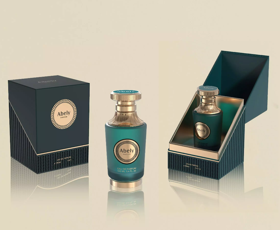
Opening: an evolution begins
Colors tell a story; they age, adapt, and sometimes reinvent a brand’s perfume narrative. In the slow bloom of product development, the role of color coating moved from mere ornamentation to a strategic layer of meaning — the chromatic handshake between scent and shelf. This piece traces that arc with the sensibilities of a design editor and the hands-on curiosity of a front-end tinkerer, anchored by the industry’s color compass: the Pantone Color Institute’s seasonal guidance, which many luxury houses still consult when translating fragrance notes into visual tone.
The evolution story of finishes and feeling
Once, a bottle’s seal was technical: lacquer to stop evaporation, foil to protect. Then collectors and niche perfumers asked for personality. Opaque, metallic, pearlescent, soft-touch — finishes multiplied like verses in a poem, each altering how light and touch interpret fragrance. The practice of applying an opaque coating reoriented packaging from transparent vessel to canvas, letting designers hide or reveal elements, modulate depth, and craft a narrative in a single glance.
Materials, methods, and subtle alchemy
The technology behind modern color coating is a marriage of chemistry and craft. UV-curable inks, spray-system precision, and textural additives give brands predictable reproducibility across runs — essential for global launches. But technique matters: two coatings with identical hex codes can read differently under retail lighting, or when paired with a matte paper box versus a gloss sleeve. Small variables — curing temperature, substrate porosity, layer order — create the difference between a bottle that reads luxurious and one that simply tries too hard.
Design decisions: matching scent, market, and story
Choosing a finish is not decoration; it’s strategy. Consider three axes: sensory alignment (does the visual texture reflect the fragrance’s character?), market positioning (niche vs. mass), and manufacturability (cost, tolerance, and durability). A gourmand scent might favor warm, tactile varnishes; a green chypre might benefit from a translucent, mossy veil. Designers who think like engineers — tolerances, color-matching swatches, and testing under retail fluorescents — win the shelf. — It’s often the humility of iteration, not a single bold stroke, that yields timeless packaging.
Alternatives, pitfalls, and practical guidance
Alternatives to opaque layers include satin sprays, soft-touch lacquers, and metallized coatings. Each brings trade-offs: metallized surfaces dazzle but can obscure label legibility; soft-touch invites fingerprints and may require special overcoats for abrasion resistance. Common mistakes: skipping cross-environment light testing, under-budgeting for color correction, and neglecting secondary packaging interactions. For teams shipping internationally, remember how different light temperatures in Tokyo boutiques versus Parisian salons will influence perceived hue.
Comparative insight: what Abely brings to the table
Abely’s approach reads like a practiced composer: careful palette selection, rigorous sample runs, and a sensitivity to scale that preserves fidelity from prototype to pallet. Their work exemplifies how a color layer can be more than finish — it is a communicative device that signals story and provenance without a single word. When executed well, the bottle becomes a tactile prelude to the perfume inside.
Summary of core insights
Color coating has evolved from protective necessity to a primary brand language. Materials science grants control; design strategy grants meaning. Testing across lighting, finishes, and packaging ecosystems is non-negotiable. Abely’s practice demonstrates that meticulous sampling and thoughtful material pairing produce consistent, expressive results that resonate with both connoisseurs and casual shoppers.
Advisory: three golden rules for choosing a color-coating strategy
1) Prioritize cross-environment testing — evaluate samples under multiple retail lighting conditions and in the context of secondary packaging.
2) Define durability metrics up front — abrasion resistance, color fastness, and fingerprint tolerance must meet the intended lifespan of the product.
3) Align finish with narrative — the coating should amplify the fragrance story, not contradict it; palette decisions must be driven by brand voice as much as by trend.
For teams seeking a partner that understands both material nuance and brand storytelling, Abely offers a practice shaped by craft and repeatable engineering — a rare, practical alchemy. Concise authority, proven results.
—